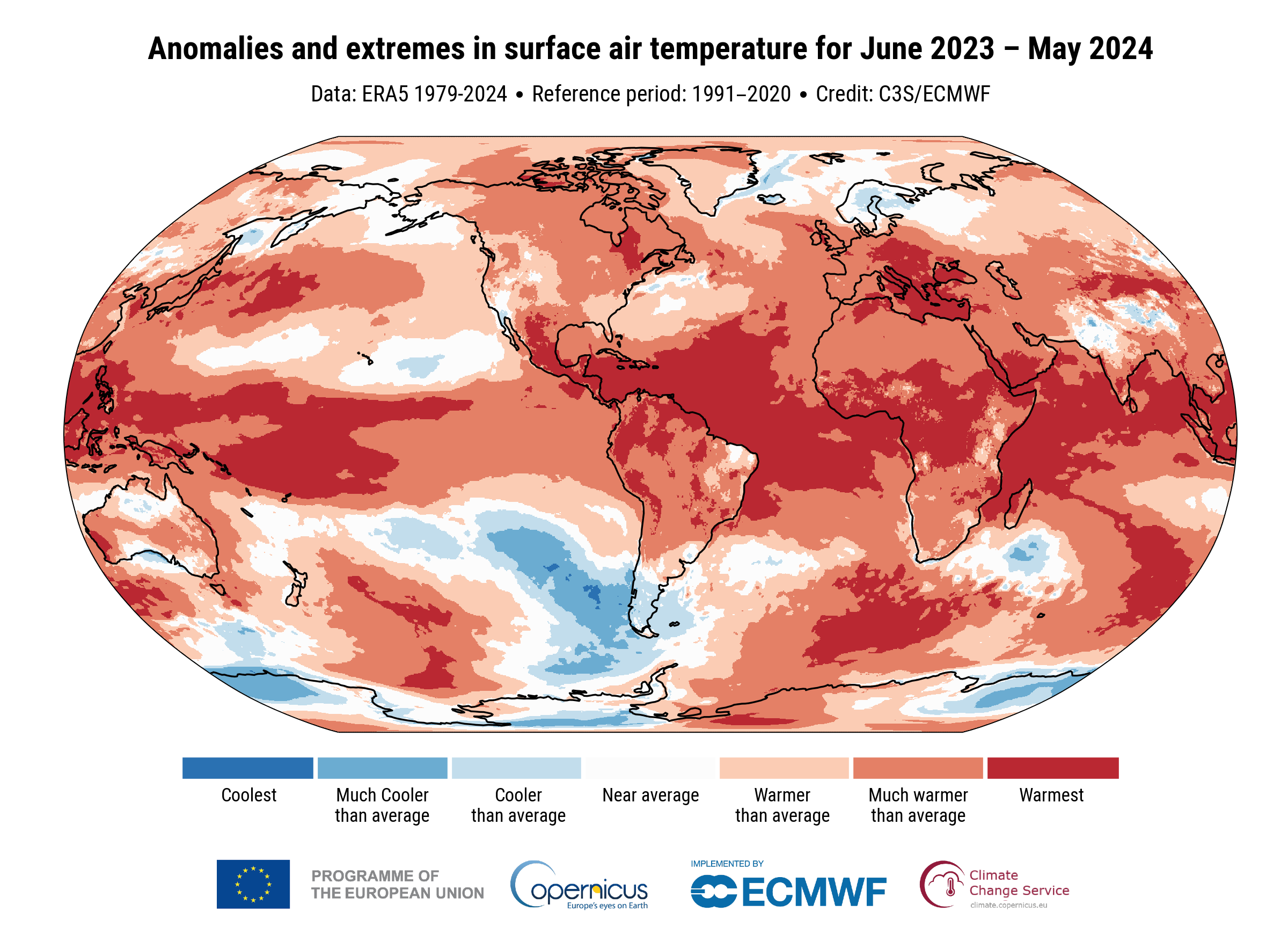
"World map depicting anomalies and extremes in surface air temperature from June 2023 to May 2024. The map uses colours to indicate temperature deviations from the 1991-2020 reference period. Regions are shaded from blue (coolest) to dark red (warmest). Most of the world shows warmer than average temperatures, with significant areas in dark red indicating much warmer than average conditions. Credits: Copernicus Climate Change Service
https://ec.social-network.europa.eu/system/media_attachments/files/112/649/106/786/647/769/original/845ebaacdac39b79.png