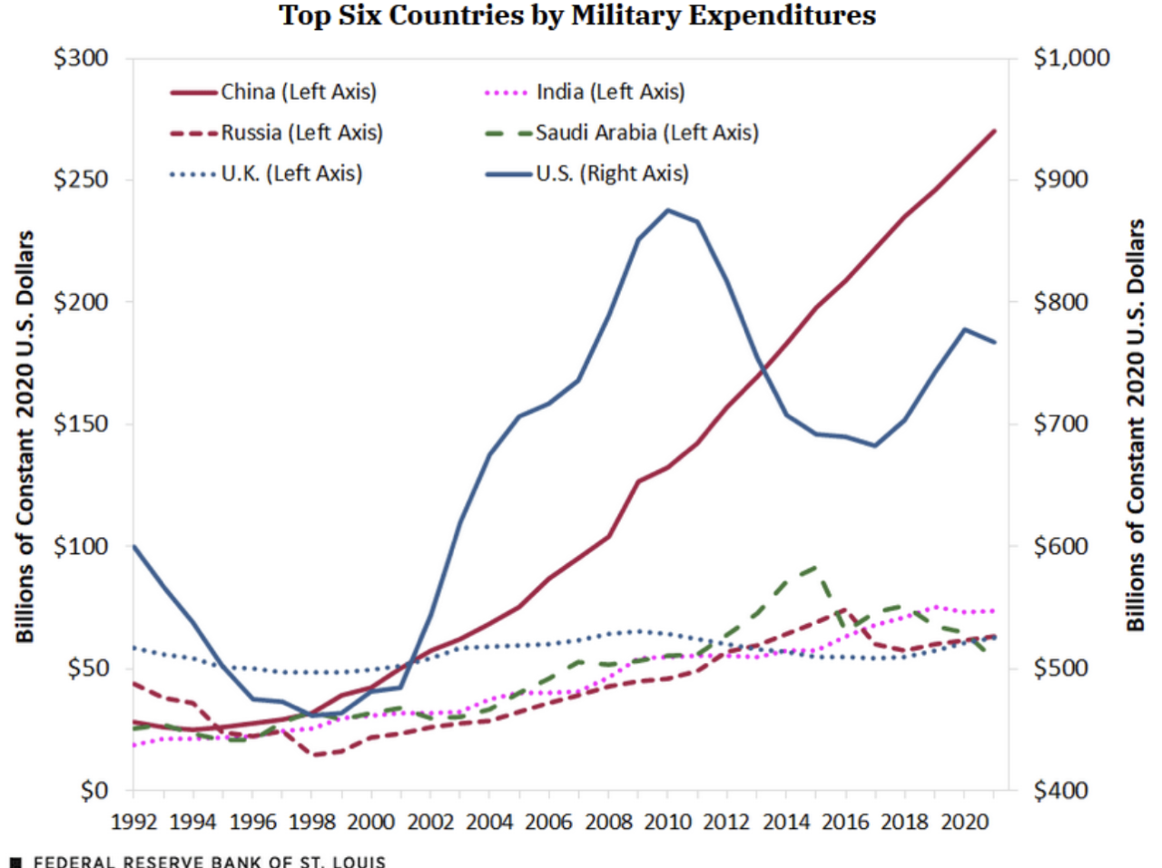
A line graph from the fed that ostensibly shows the top six countries by military expenditure. However the y-axis is actually split between left and right axis. On the left it goes between 0 and 300 billion dollars. The right side goes between 400 and 1000 billion. Every single nation (China, Russia, UK, India, and Saudi Arabi) are tagged to be using the left side axis. Only the U.S. is using the right side axis indicating it is just slightly under 800 billion dollars. However due to the bullshit graph, it looks like China is spending significantly more than the U.S. on the military when in actuality it's at roughly 275 billion dollars.
https://cdn.masto.host/laserdisc/media_attachments/files/109/747/211/959/549/609/original/7ac06531aba8d8f6.png