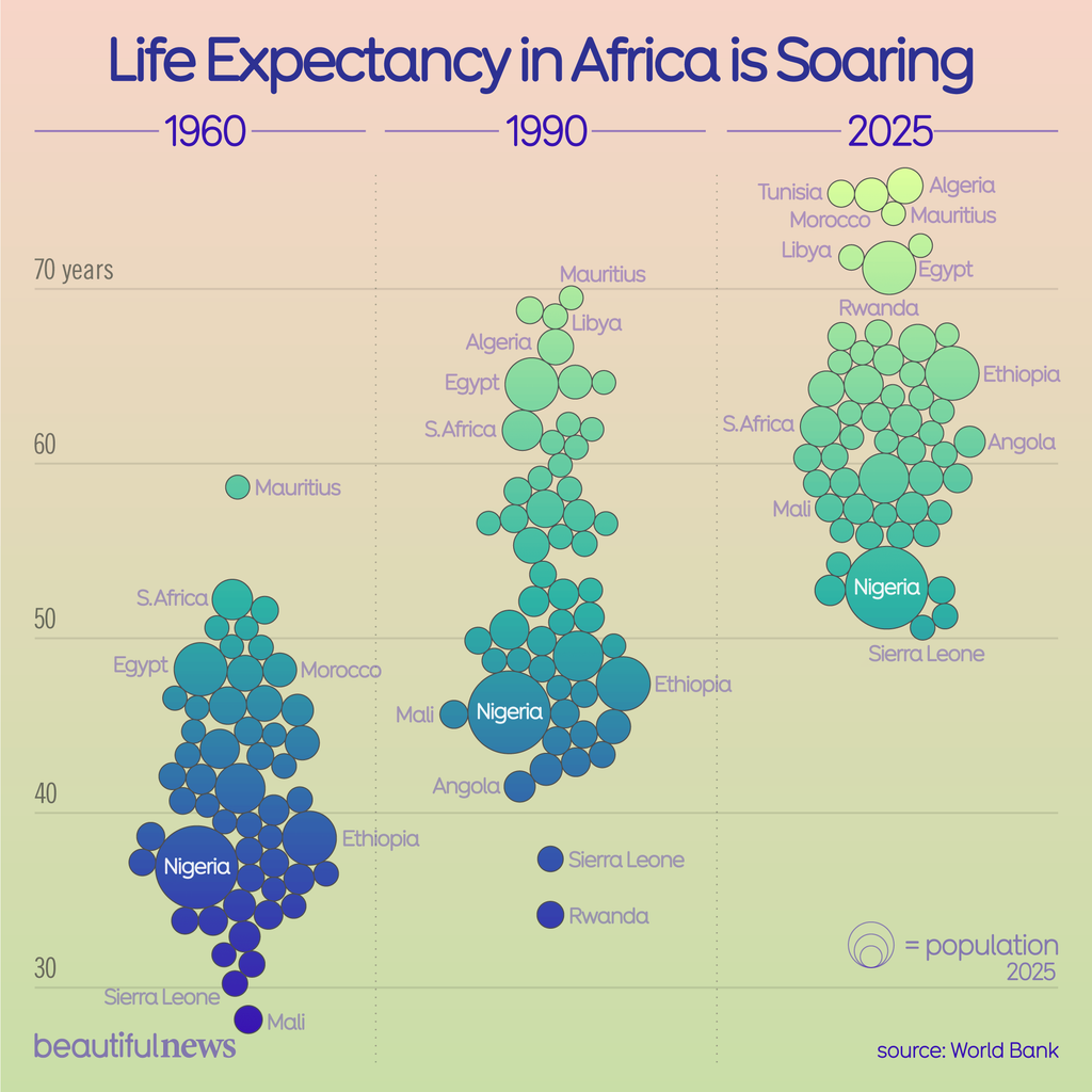
Vertical beeswarm chart called 'Life Expectancy in Africa is Soaring' comparing African countries across three time periods: 1960, 1990, and 2025. Bubble size represents population. In 1960, most countries clustered between 30–50 years, with Sierra Leone and Mali lowest around 28–30. By 1990, the cluster shifted upward to 35–70, with Mauritius leading at nearly 70. By 2025, most countries sit between 55–75 years, led by Tunisia, Algeria, Morocco, and Mauritius above 70. Notable risers include Rwanda and Ethiopia, now above 65. Nigeria, the largest bubble, moved from around 37 to 53. Source: World Bank. Beautiful News."
https://cdn.masto.host/vissocial/media_attachments/files/116/635/789/109/061/505/original/6d03710df11730f5.png
 Information Is Beautiful
 All GNU social JP content and data are available under the