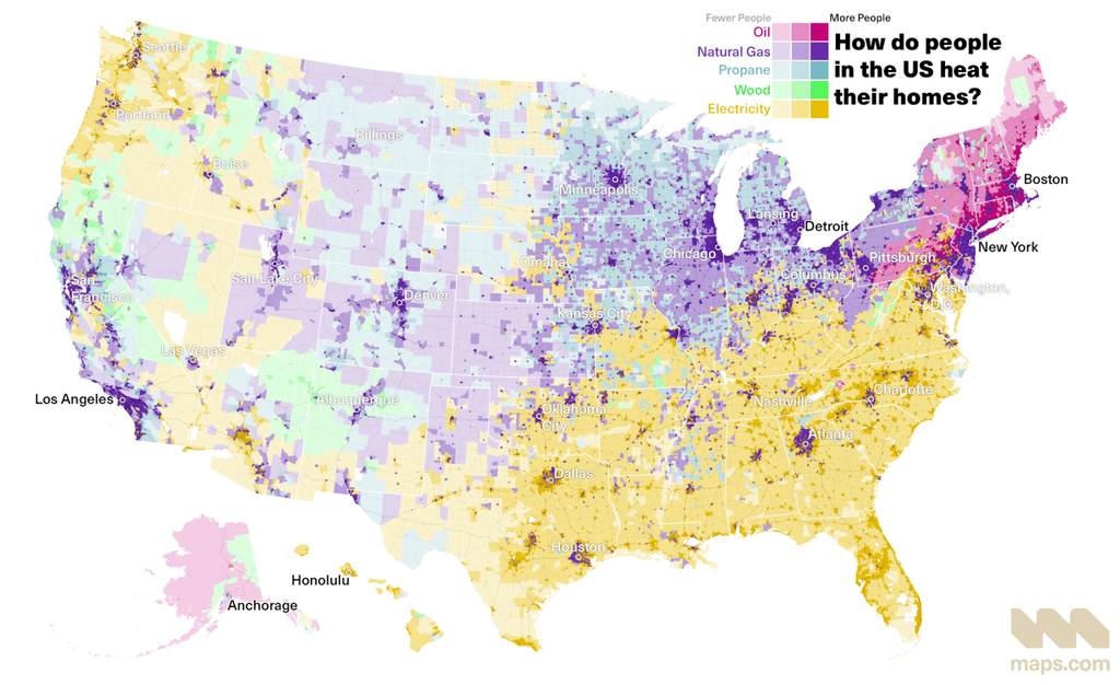
A map of the United States displaying how people heat their homes, with different heating sources represented by distinct colors. The map highlights regions where oil (dark purple), natural gas (light purple), propane (green), wood (orange), and electricity (yellow) are used for heating. The density of each color indicates the prevalence of a specific heating method in various areas, with the Northeastern and parts of the Midwest regions showing higher concentrations of oil and natural gas use.
https://cdn.masto.host/vissocial/media_attachments/files/116/580/109/642/506/349/original/dd49bf1f4840452d.png
 Information Is Beautiful
 All GNU social JP content and data are available under the