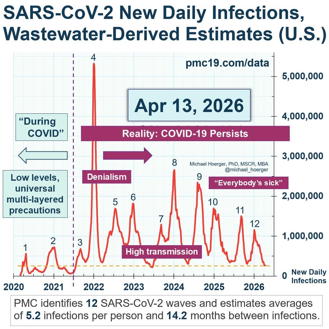
infographic from Michael Hoerger labelled SARS-CoV-2 New Daily Infections, Wastewater-Derived Estimates (U.S.) April 13, 2026, shows the waves of estimated Covid infections spanning 2020–2026. x-axis displays the years, y-axis shows numbers of daily infections. Each peak is numbered 1–12. Peak 1 and 2 are in 2020 and 2021. Two labels in blue boxes above the peaks “During Covid” and “Low levels, universal multi-layered precautions”. A vertical purple dotted line divides peaks 2 and 3. Label spanning the graph over waves 3–12: “Reality: Covid-19 Persists”. Three labels in dark pink boxes: 1) “Denialism” above waves 3–5, 2) “High transmission” across waves 6–9, 3) “Everybody’s sick” above waves 10–12. A horizontal yellow dotted line spans the graph showing that the brief, low levels of transmissions since mid-2021 have been higher than most of "During Covid." Label beneath graph: PMC identifies 12 SARS-CoV-2 waves and estimates averages of 5.2 infections per person and 14.2 months between infections.
https://files.ohai.social/media_attachments/files/116/411/594/066/168/712/original/998ae4f9323dcf56.jpg
 katharine
 All GNU social JP content and data are available under the