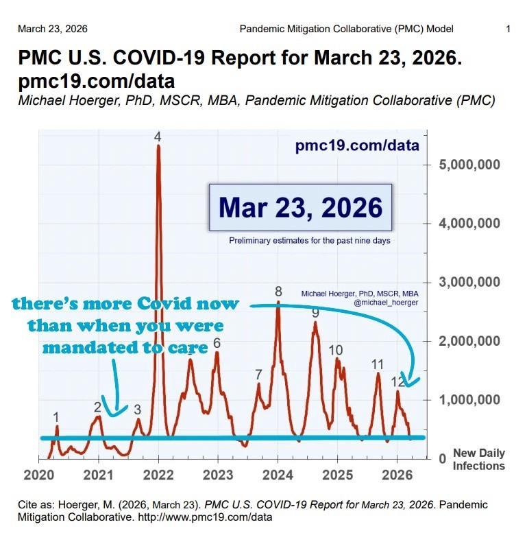
infographic from Michael Hoerger labelled PMC U.S. Covid-19 Report for graph March 23, 2026, shows the waves of estimated Covid infections spanning 2020–2026. x-axis displays the years, y-axis shows numbers of daily infections. the first three waves, in 2020, early 2021, and mid-2021 show wave peaks estimated between 500,000 and 800,000 infections. the fourth wave, the rise of omicron, peaks over 5 million. the next seven wave peaks range between 1 million and 2.5 million. As of March 2026, the US is in its 12th Covid wave.I added a straight teal line that spans the width of the graph along with arrows pointing to the early phase of the pandemic and the current phase and added text to read “there’s more Covid now than when you were mandated to care.”
https://files.ohai.social/media_attachments/files/116/298/811/190/083/598/original/386594f39d6e1e51.jpeg
 katharine
 All GNU social JP content and data are available under the