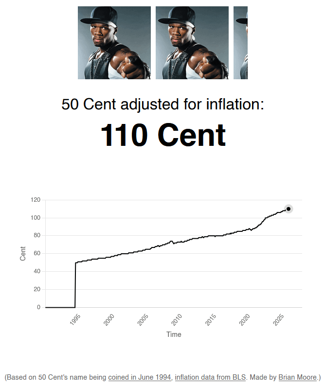
This image is a humorous data visualization titled “50 Cent adjusted for inflation: 110 Cent,” featuring three repeated headshots of rapper 50 Cent at the top. Below, a line graph plots “Cent” on the y-axis (0 to 120) against “Time” on the x-axis (1995 to 2025). The line starts at 0 until June 1994—when 50 Cent’s stage name was adopted—then jumps vertically to 50, and rises gradually thereafter, reaching 110 by 2025, marked with a black dot. The caption clarifies this is a pun: “50 Cent” the artist’s name, not currency, is humorously treated as if it were a monetary value inflated over time using BLS inflation data. A footnote states: “Based on 50 Cent’s name being coined in June 1994, inflation data from BLS. Made by Brian Moore.” The graphic uses minimal design—black lines on white background—to emphasize the joke linking the rapper’s name to economic indexing.
https://cdn.masto.host/vissocial/media_attachments/files/116/222/676/291/608/749/original/a2304a87d7d22666.png
 Information Is Beautiful
 All GNU social JP content and data are available under the