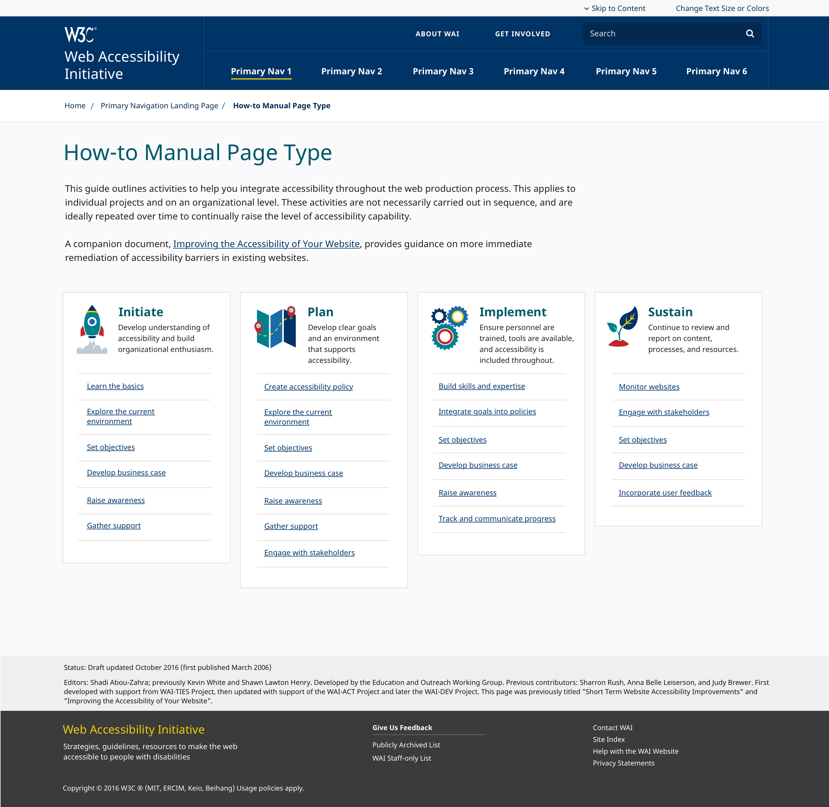
A mockup of what would become the WAI website, here a "How-to Manual Page Type" with the dark blue header, well-balanced typography, and four columns with the Initiate/Plan/Implement/Sustain sections from the existing "Planning and Managing Web Accessibility" guide. In contrast to the current page, the icons were playful and colorful with red, yellow, teal, and blue accents. A rocket with steam coming out of it, a map with a dashed line between two markers, cogwheels, and a little plant. The footer in grey and dark grey is very similar to the end result.
https://cdn.masto.host/yatilsocial/media_attachments/files/116/029/552/460/123/810/original/76f096c1dae92933.png