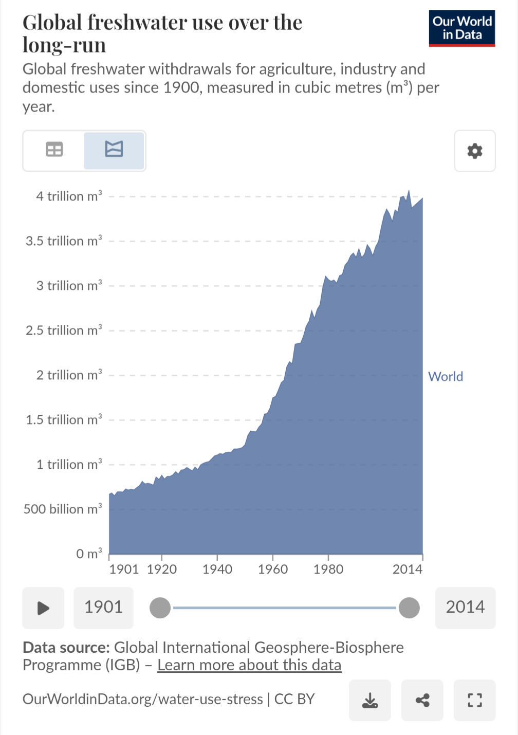
"The image is a line graph titled "Global freshwater use over the long-run," showing global freshwater withdrawals for agriculture, industry, and domestic uses since 1900, measured in cubic meters per year. The x-axis represents the years from 1901 to 2014, and the y-axis represents the volume of freshwater use in cubic meters, ranging from 0 to 4 trillion m³. The graph shows a significant increase in freshwater use over time, with a sharp rise starting around the 1950s. The area under the curve is shaded in blue, and the label "World" is placed on the right side of the graph. The data source is the Global International Geosphere-Biosphere Programme (IGBP), and the graph is credited to Our World in Data. The graph includes interactive elements such as a timeline slider and download and share buttons. Provided by @altbot, generated privately and locally using Ovis2-8B 🌱 Energy used: 0.210 Wh" Source: https://ourworldindata.org/water-use-stress
https://files.mastodon.social/media_attachments/files/114/744/505/584/564/877/original/3ad06d1aa4b70f92.png