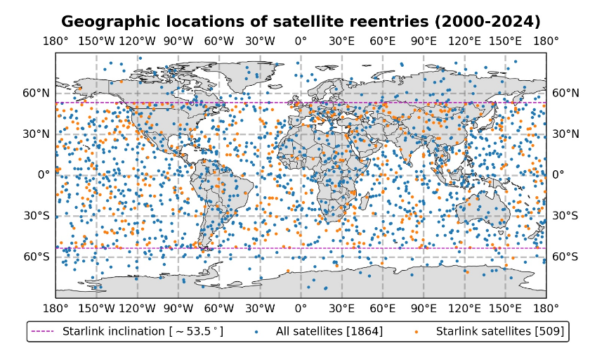
A map of approximate satellite reentry locations over the past 5 years projected onto a world map. Essentially looks randomly distributed between 53 degrees north and south because of the square projection - I think it would be weighted more toward the top and bottom of the distribution if it had a true globe-shape. Figure from Oliveira et al. 2025
https://files.mastodon.social/media_attachments/files/114/543/481/597/985/810/original/28ef0ce2c9ae3c67.png