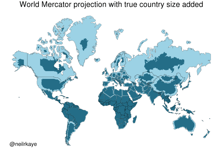
World map using a Mercator projection, but with the true relative sizes of countries overlaid in a darker shade. This illustrates how the standard Mercator projection distorts the size of landmasses, particularly those further from the equator, by showing the actual size differences. For example, Canada and Russia appear much smaller in their true relative size compared to their depiction in a standard Mercator projection.
https://cdn.masto.host/vissocial/media_attachments/files/114/512/895/505/793/828/original/d4aa7ddbdb764138.png