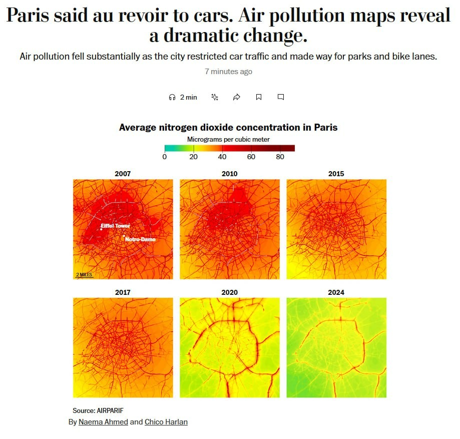
The image is a visual representation of the changes in average nitrogen dioxide concentration in Paris from 2007 to 2024. The title reads, "Paris said au revoir to cars. Air pollution maps reveal a dramatic change." Below the title, a subtitle states, "Air pollution fell substantially as the city restricted car traffic and made way for parks and bike lanes." The image features a color-coded map of Paris, with a legend indicating nitrogen dioxide concentration levels in micrograms per cubic meter, ranging from 0 to 80. The maps are arranged in a grid format, with each map representing a different year: 2007, 2010, 2015, 2017, 2020, and 2024. The color gradient transitions from red (high concentration) to green (low concentration). The 2007 map shows high concentrations of nitrogen dioxide, particularly around the Eiffel Tower and Notre-Dame, with red and orange hues dominating. By 2024, the concentration has significantly decreased, with green and yellow hues indicating lower levels of pollution. The source of the data is AIRPARIF, and the image is credited to Naema Ahmed and Chico Harlan. The maps are accompanied by a scale indicating distances in miles, with a 2-mile marker visible. The overall layout is clean and informative, effectively illustrating the impact of urban planning on air quality. Provided by @altbot, generated privately and locally using Ovis2-8B 🌱 Energy used: 0.307 Wh
https://media.jorts.horse/horse-media/media_attachments/files/114/326/268/223/370/483/original/66b265254398a5e8.jpg