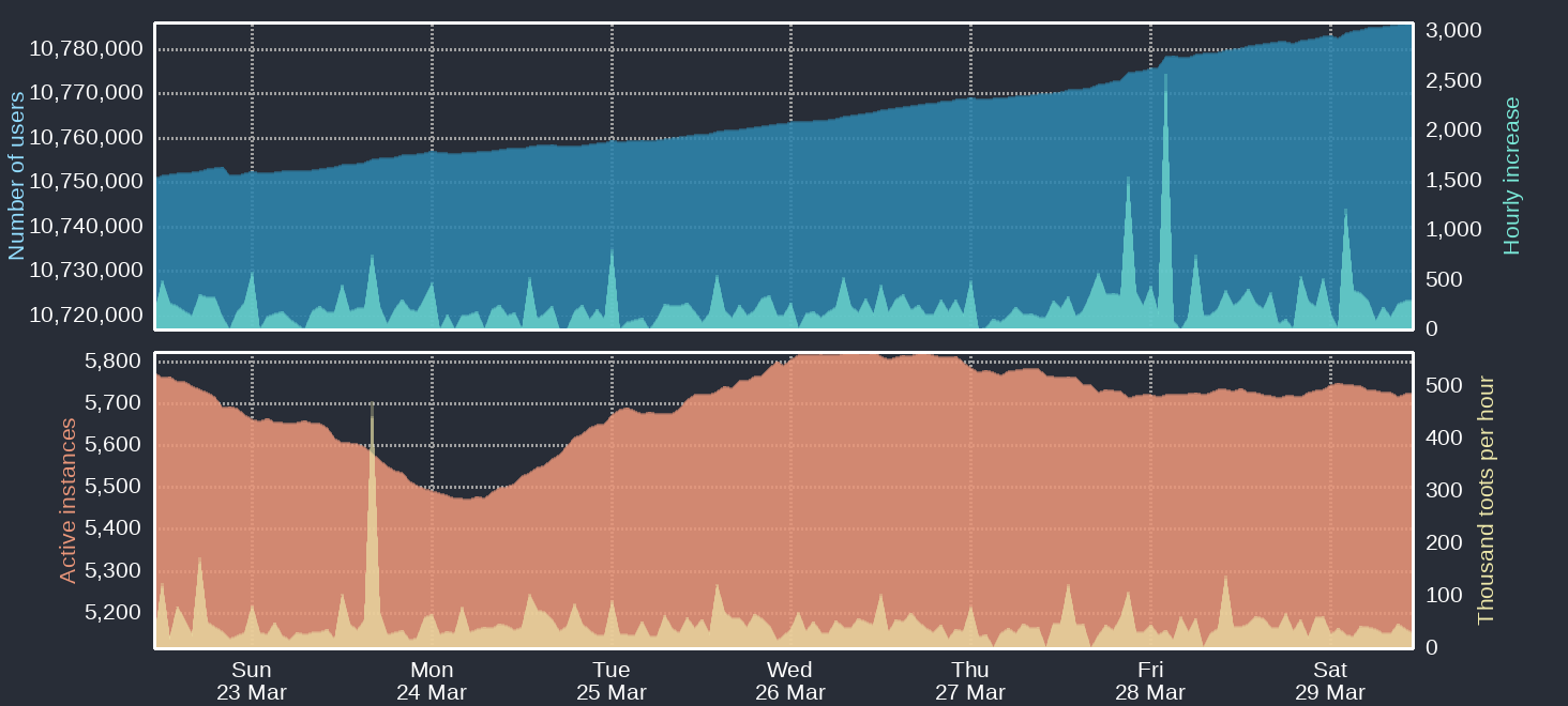
Four time-based charts Upper blue area: Number of Mastodon users Upper cyan area: Hourly increases of number of users Lower orange area: Number of active instances Lower yellow area: Thousand toots per hour For current figures please read the text of this post
https://files.mastodon.social/media_attachments/files/114/245/370/133/933/608/original/24cfea87ecd596d5.png