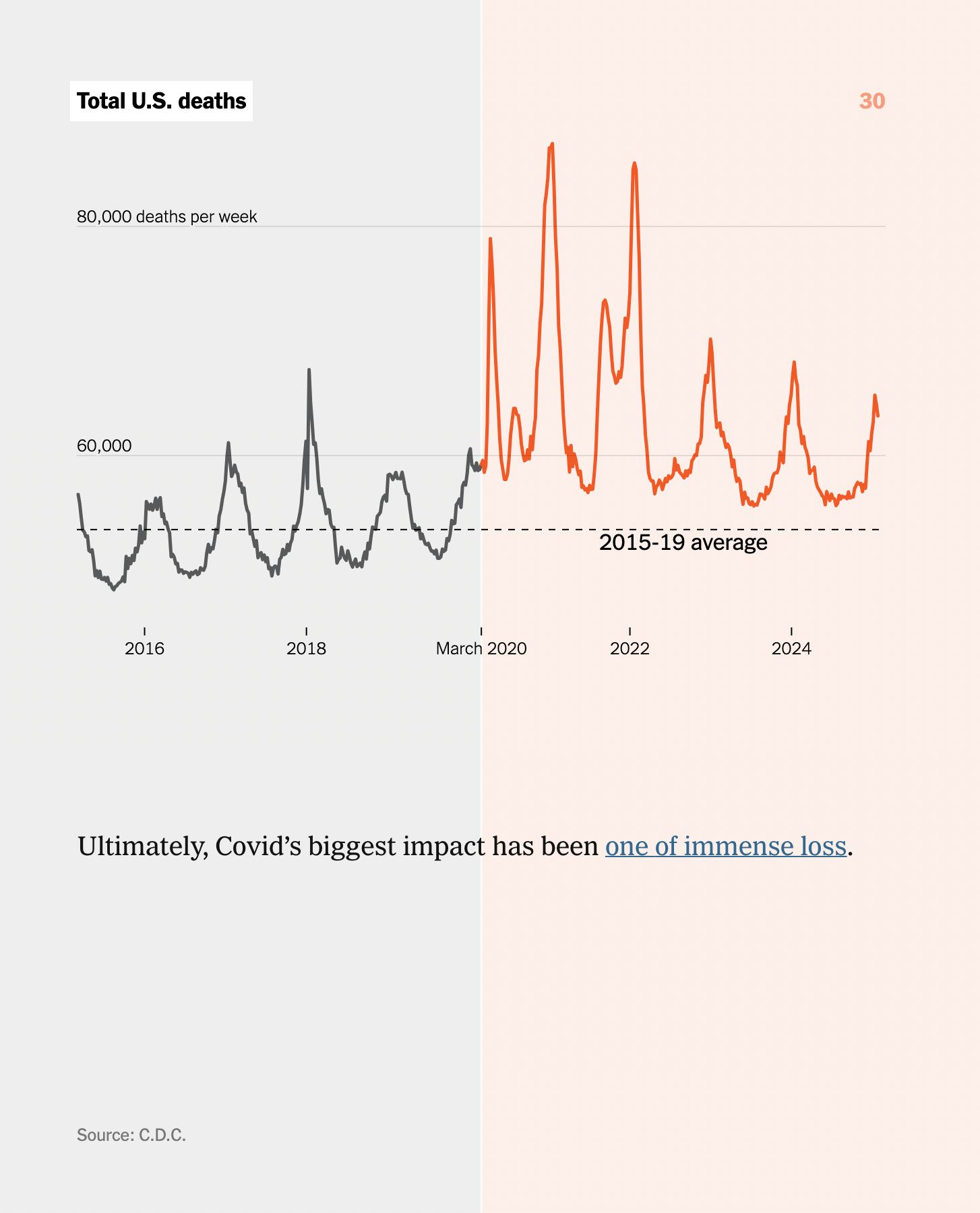
ALT: "A line graph showing total U.S. deaths from 2016 to 2024. Pre-2020 data in black indicates a stable pattern. Post-March 2020, data in orange shows spikes above the 2015-19 average, marking Covid-19's impact . Source: C.D.C.
https://cdn.masto.host/vissocial/media_attachments/files/114/145/552/186/347/481/original/5b1fd4498f432c7b.png