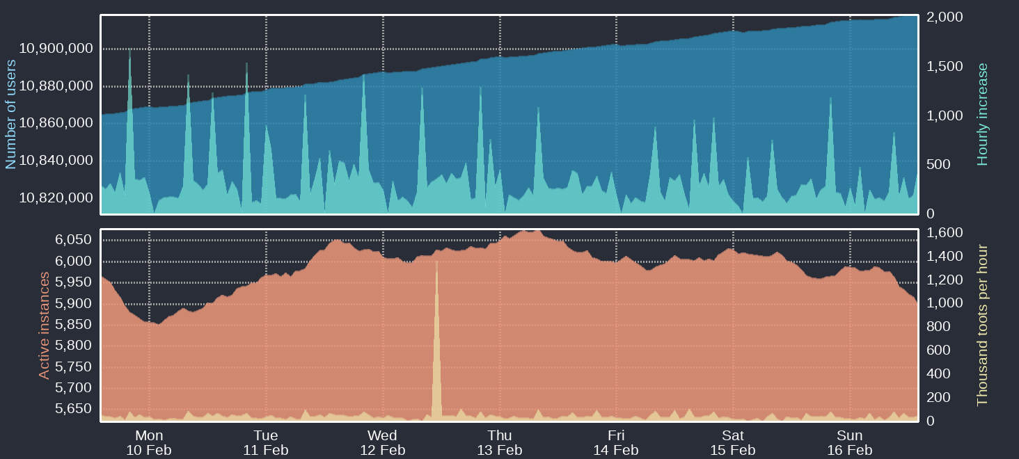
Four time-based charts Upper blue area: Number of Mastodon users Upper cyan area: Hourly increases of number of users Lower orange area: Number of active instances Lower yellow area: Thousand toots per hour For current figures please read the text of this post
https://files.mastodon.social/media_attachments/files/114/013/923/127/960/975/original/ddb8cbb80606abc9.png