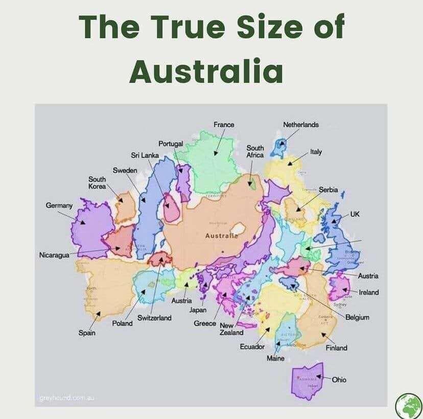
A map showing the true size of Australia compared to various countries and regions. It illustrates how much larger Australia is than many other countries, including the United States, India, and most of Europe. The map uses a projection that accurately represents the relative sizes of landmasses.
https://cdn.masto.host/vissocial/media_attachments/files/113/949/258/764/382/847/original/a90e6e7e0f4383cf.jpeg