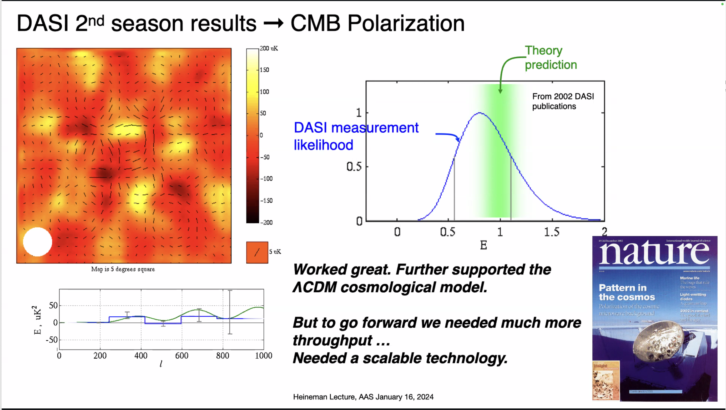
DASI 2nd season results → CMB Polarization Map of a section of the esky showing red and yellow blobs. On top of this is a grid of small lines indicating the polarization direction. Plot showing the DASI data. It forms a bell curve, which overlaps with the theory prediction. • Worked great. Further supported the ACDM cosmological model. • But to go forward we needed much more throughput ... Cover of Nature featuring an image of DASI - Pattern in the cosmos.
https://media.astrodon.social/media_attachments/files/113/853/201/670/333/582/original/4a5f3fafe9883272.png