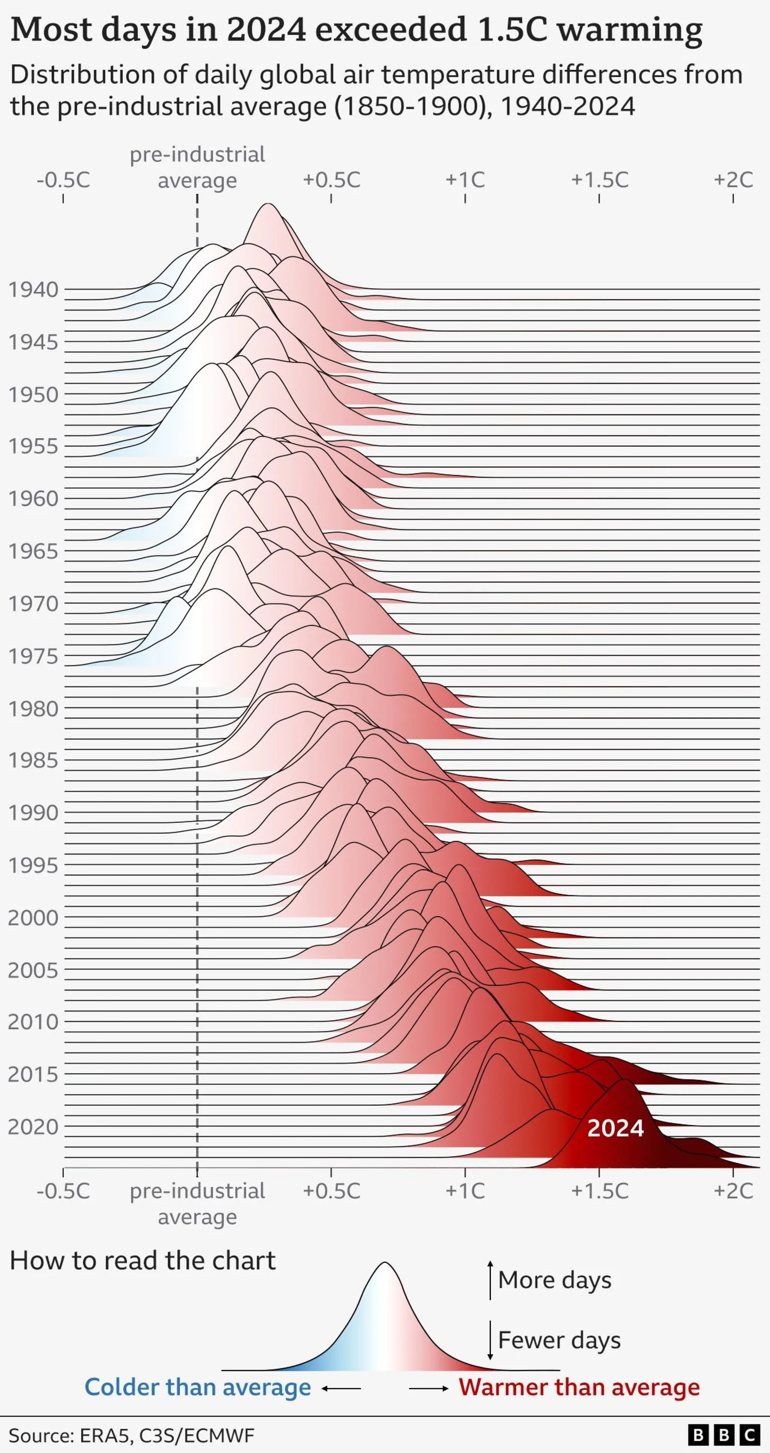
The image shows a chart of daily global air temperature deviations from the pre-industrial average (1850–1900) from 1940 to 2024. Each wave represents a year's temperature distribution. - **X-axis:** Temperature deviations (-0.5°C to +2°C). - **Colors:** Blue indicates cooler days, red shows warmer days, with darker red for higher deviations. - **Trend:** Early years cluster near the pre-industrial average. From the 1980s onward, waves shift increasingly to the right, reflecting global warming. - **2024:** Most days exceeded +1.5°C, shown by a broad, dark red wave. The chart highlights the intensifying climate crisis. Data sources: ERA5, C3S/ECMWF; chart by BBC.
https://files.mastodon.social/media_attachments/files/113/812/594/415/313/243/original/cfaf5383d505f7e7.png