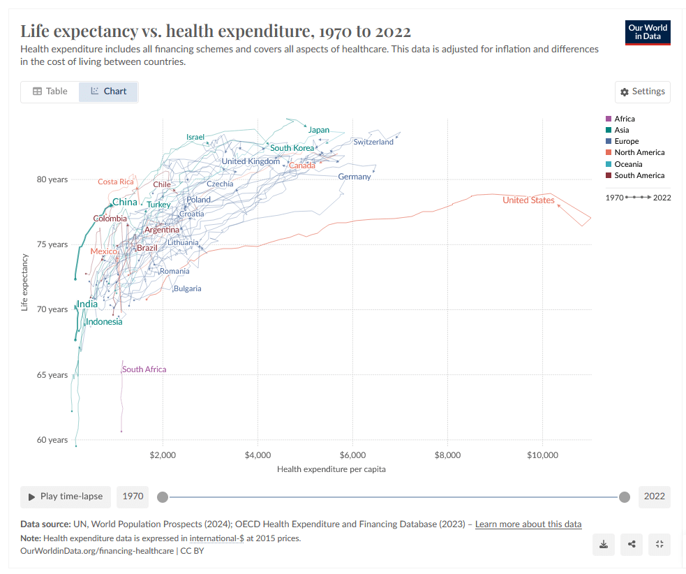
A line chart comparing life expectancy vs. health expenditure per capita from 1970 to 2022 across multiple countries. The y-axis shows life expectancy (60-85 years), x-axis shows health expenditure ($0-$10,000). Lines track each country's progress, with the United States notably showing high expenditure but lower life expectancy than peers like Japan and Switzerland. Countries are color-coded by continent. Source: Our World in Data
https://cdn.masto.host/vissocial/media_attachments/files/113/664/255/670/172/401/original/e6e6d41ff572773e.png