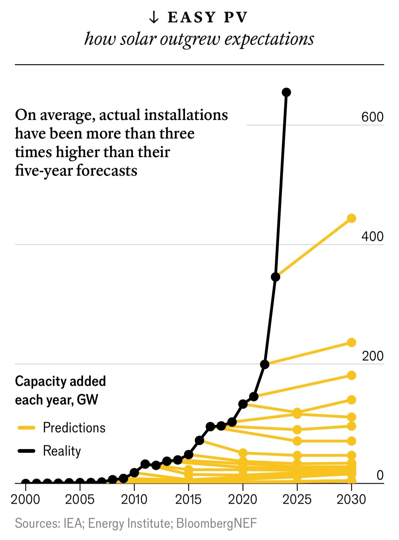
A line chart plots global capacity of solar power measured in gigawatts. From 2010 capacity starts to grow exponentially, way beyond a series of predictions drawn as lines in yellow. Actual installations have been more than 3x higher than their five year forecasts.
https://cdn.masto.host/vissocial/media_attachments/files/113/075/449/126/460/358/original/e6a8f8c0930c4496.jpeg