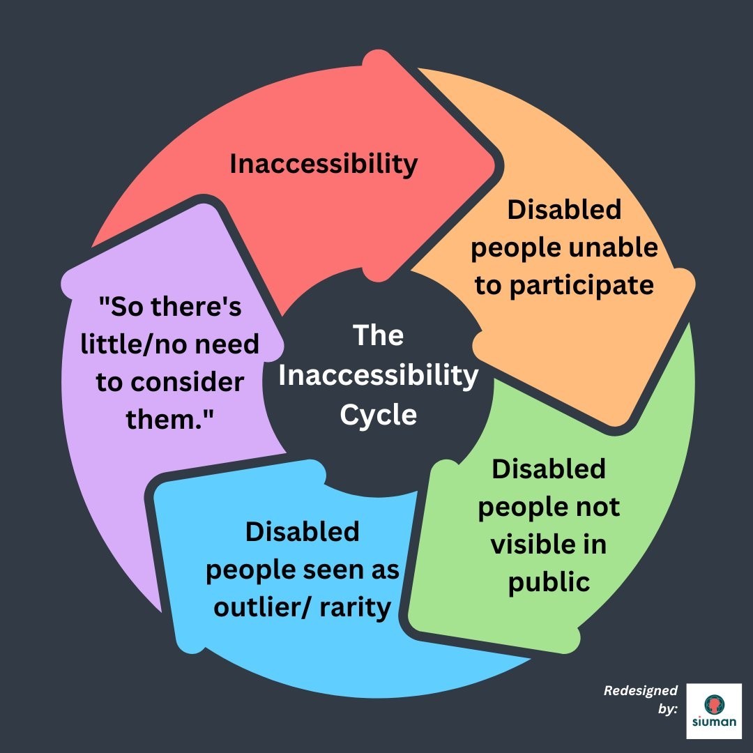
An infographic showing The Inaccessibility Cycle. There is a circle of arrows, showing a cycle as follows: > Inaccessibility > Disabled people unable to participate > Disabled people not visible in public > Disabled people seen as outlier/rarity > So there's little/no need to consider them. The last arrow points back to Inaccessibility, completing the cycle. The original infographic is by Pacing Pixie, redesigned by Siuman.
https://josh.tel/system/media_attachments/files/112/100/855/308/721/413/original/0fcc08759a6d0471.jpeg