Untitled attachment
https://s3.amazonaws.com/zundan-mastodon/media_attachments/files/111/570/435/736/349/982/original/5108af96f7ea0d55.png
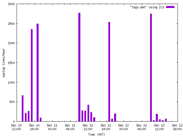
僕の使っているコマンドラインツールの #ひかえめなアドベントカレンダー2023 12月12日分はgnuplotです。データを集計したらグラフにして眺めてみたくなる!!
例えば、syslogの行数を眺めてみます。手元ではsyslogは下記のような形式です。
Dec 12 09:30:27 misoan systemd[1]: Mounted /boot/efi.
Dec 12 09:30:27 misoan systemd[1]: Reached target Local File Systems.
ざっくり分以降を取り除いて1時間ごとの行数を集計します。
$ cut -d: -f1 syslog | uniq -c > logs.dat
各行には、その時刻の行数と月・日・時が記録されます。
2746 Dec 12 09
ここからgnuplotの出番。X軸を時刻としてフォーマットを指定し、X軸のラベルのフォーマットを指定し、各軸のタイトルを指定し、棒グラフの横幅を30分間分に指定しておいて、2カラム目以降をX軸、1カラム目をY軸として棒グラフをプロットします。
$ gnuplot
gnuplot> set xdata time
gnuplot> set timefmt "%b %d %H"
gnuplot> set format x "%b %d\n%H:%M"
gnuplot> set xlabel "Time (HST)"
gnuplot> set ylabel "syslog lines/hour"
gnuplot> set boxwidth 1800
gnuplot> set style fill solid
gnuplot> plot "logs.dat" using 2:1 with boxes
画像ファイルとして保存するには例えば下記のように操作します。
gnuplot> set term push; set term png small; set output "logs.png"
gnuplot> replot
gnuplot> unset output; set term pop
朝の起動時にログが多く記録されること、11日の夜はAdvent of Codeのために2度目の起動をしたことがわかります。10日の夕方電源を切る前にログが多いのはどうしてだろう…。
GNU social JP is a social network, courtesy of GNU social JP管理人. It runs on GNU social, version 2.0.2-dev, available under the GNU Affero General Public License.
![]() All GNU social JP content and data are available under the Creative Commons Attribution 3.0 license.
All GNU social JP content and data are available under the Creative Commons Attribution 3.0 license.