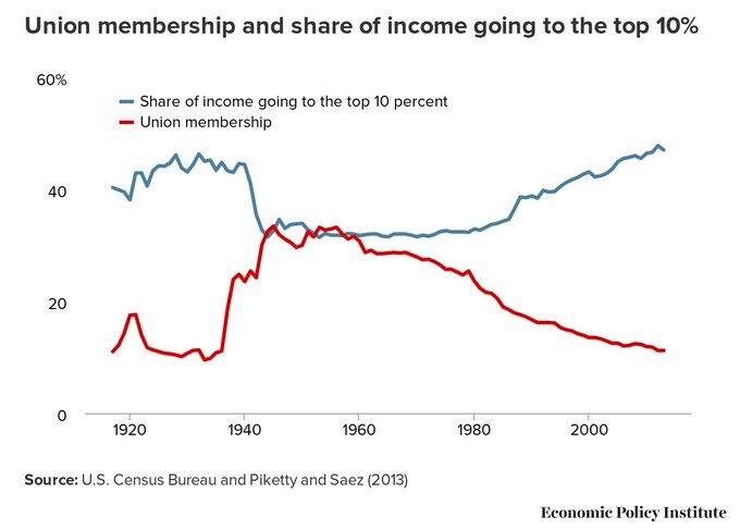
Line graph showing Union membership and share of income going to the top 10% from 1920 to 2000 The graph shows how the more Union Membership rises, the less income the top 10% gets. The two lines were almost equal between the late 40s and the 60s but union membership plummeted since the 80s, while the top 10% share of income has exploded at the same time. Source: U.S. Census Bureau and Piketty and Saez (2013) Economic Policy Institute
https://mastodon.nz/system/media_attachments/files/110/710/472/050/040/591/original/3f10555e5ce41969.jpeg